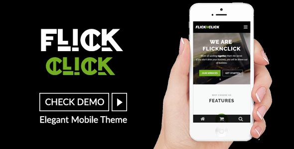
Flicknclick - Responsive Mobile/Smartphone Theme
Flicknclick is a modern, mobile-responsive WordPress theme designed for businesses, online stores, portfolios, and creative websites. It delivers a clean, professional layout that adapts perfectly across smartphones, tablets, and desktop devices.
Built with performance and usability in mind, Flicknclick offers a lightweight structure, smooth navigation, and powerful customization options to help you build a stunning website quickly.
Main Highlights
- 100% Responsive & Mobile-Optimized Design
- WooCommerce Compatible for Online Shops
- SEO-Friendly Structure for Better Rankings
- Easy Logo Upload & Theme Customizer Options
- Homepage Widget Areas & Multiple Layout Sections
- Retina Ready & Cross-Browser Support
- WPML Ready for Multilingual Websites
- Clean Code & Fast Loading Performance
Whether you want to create an eCommerce store, corporate website, or modern portfolio, Flicknclick provides the flexibility and design quality needed for a professional online presence.
Start building your responsive WordPress website today with Flicknclick!
Flicknclick – Responsive Mobile/Smartphone Theme adapts to your customer’s chosen device, whether it is a smartphone (iPhone, Android) or tablet (iPad). The responsive layout adjusts to the changing mobile trends. The professional and crisp design provides a clean and simple user experience..
Flicknclick has a responsive, mobile first grid system that adapts your website to mobile devices and the desktop or any other viewing environment. Theme features One page layout template, 2 Widget Areas, Blog layouts and more. Powerful but simple Theme Options for full CMS control with easy Logo Upload and Social Networking etc. Flicknclick is WooCommerce Compatible, Multilingual Ready (WPML), Retina-Ready, Search Engine Friendly and W3C Markup Validated. Cross-Browser compatible.
If you want to dominate mobile world with mobile-friendly content, then FlicknClick is the way to go.
This template material design, modern design, clean design, clean code and easy to customize, easy to cange color and many more.
Features
Creative Design
Easy to Customize
Clean Design
Clean Code
Many Pages
Font Awesome
Material Design
Store
Blog
Team
and others