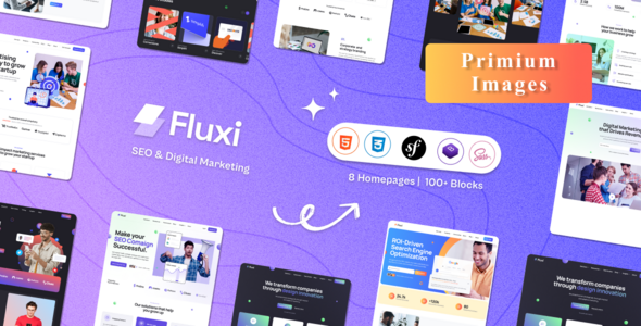
Fluxi - SEO Digital Marketing Symfony Template
Fluxi features a modern and visually appealing design with a clean and creative layout. It provides an intuitive and user-friendly interface, making customization easy according to your project needs. Built with the Symfony framework and the Bootstrap 5 grid system, the template is fully responsive and renders perfectly on all devices, including tablets and mobile phones.
Absolutely! Fluxi Symfony is developed using Bootstrap 5, a powerful front-end framework known for its responsive features. This ensures the template automatically adapts to different screen sizes and devices for an optimal user experience.
With Bootstrap’s responsive utilities, the layout and components of Fluxi Symfony dynamically adjust based on screen resolution, offering a seamless browsing experience for all users.
Features Overview
- Unlock the Power of Symfony
Symfony is a robust PHP framework known for its scalability, flexibility, and modern architecture. It simplifies complex development, offers built-in reusable components, and has a large, active community. Perfect for building secure, scalable, and feature-rich web applications.
Template Features
|
|
Sources and Credits
- Bootstrap
- jQuery
- Swiper JS
- Magnific Popup
Icons Used
- Free Flat Icons by Flaticon
- Free Icons by FontAwesome
Image Credits
- Allfreephotos
- Freepik
- Unsplash
- Nothingtochance
Please Note
- Images are not included in the download package. If you need the images, feel free to contact us.
- This is a Symfony Template and cannot be installed as a WordPress Theme.
Bootstrap is the most popular HTML, CSS, and JS framework for creating responsive, mobile-first websites.
Create beautiful sliders with smooth animations using the powerful Swiper Slider library.
No matter which device your visitors use, your site will run perfectly. The Fluxi Symfony template is fully responsive across all screen sizes.
All Symfony files are cleanly coded and follow W3C standards to ensure quality and compatibility.
We provide beautifully designed blog pages and single-post layouts to help you share updates, news, and stories effectively.